
Your home page, section by section
The litetile team
A home page is not one big block of text. It is a short run of sections, each with one job, stacked in the order a visitor needs them. When each section does its job, the page reads easily from top to bottom and the visitor knows what to do at the end.
This post goes through those sections one at a time: what each is for, what to write in it and what to leave out. Then it looks at how to order them so the page has a rhythm.
The hero is the first screen, before anyone scrolls. It has three parts.
The headline says what you do and, for a local business, where. Use the words a customer would type into a search box. "Roof repairs and new roofs in North Devon" works. "Welcome to our website" and "Excellence in every detail" do not, because they could belong to anyone.
One line underneath makes it specific: who you work for, what makes you different, or the detail people check first. "Family-run since 2009, insured, free quotes within a week." One sentence is enough.
One action, as a button. Say what happens when someone taps it: "Call for a quote", "Book a table", "See our prices". If you need a second action, make it quieter, as a plain link or an outlined button, so the main one stays obvious.
A photo helps if it shows your real work, place or people. If you do not have a good one yet, a hero without an image is better than a stock photo that says nothing about you.
Right after the hero, show what you sell. Three to six items is a good range: fewer looks thin, more is hard to take in at once.
Each item needs:
- a name customers would use ("Boiler servicing", not "Thermal solutions");
- one sentence on what it includes or who it is for;
- a link to more detail, if there is a page for it.
Order them by what people ask for most, not by what you enjoy doing most. Give each item the same shape, the same length of text and the same kind of icon or photo, so the eye can compare them.
Many people hesitate because they do not know what happens after they get in touch. A short steps section takes that worry away.
Three or four steps is usually right. Start each one with a verb and keep it to a line:
- Tell us about the job by phone or email.
- We visit and give you a written quote.
- We agree a date that suits you.
- We do the work and tidy up before we leave.
If your process really is "call and we come round", say that in one line instead. The steps should describe what actually happens, not make a simple service look complicated.
Visitors look for signs that you are real and good at what you do. Show them facts they can check:
- photos of finished work, your premises and the people they will meet;
- how long you have been in business, and your qualifications or memberships;
- the area you cover and the kinds of customers you work with;
- a link to your reviews on Google or another review site.
If you quote a review, use a real one, with the customer's agreement, and do not change what it means. Only use a number, such as jobs completed or years in business, if you can stand behind it.
A short questions-and-answers section handles the doubts that stop people from getting in touch: parking, payment, cancellations, how far you travel, how long a job takes.
Use real questions, in the words customers use. Four to eight is plenty on a home page. Keep each answer to two or three sentences, and link to a fuller page when the answer needs more.
This section also helps search engines and AI assistants, which look for plain questions with plain answers when they describe a business.
Someone who has scrolled to the bottom of your home page is interested. Do not leave them at a dead end. End with a short band that repeats the main action:
- a headline that names what they came for ("Need a roof checked? We can usually visit within a week.");
- the same button as in the hero;
- your phone number and email, written out, for people who prefer them.
Keep it calm. You are making the next step easy, not pressing anyone to take it.
A sensible order for most businesses is: hero, what you offer, how it works, proof, questions, closing invitation. Move proof higher if trust is the main worry in your trade, or move prices up if that is the first thing people ask. Let your visitors' questions decide.
Two habits give the page a rhythm the eye can follow.
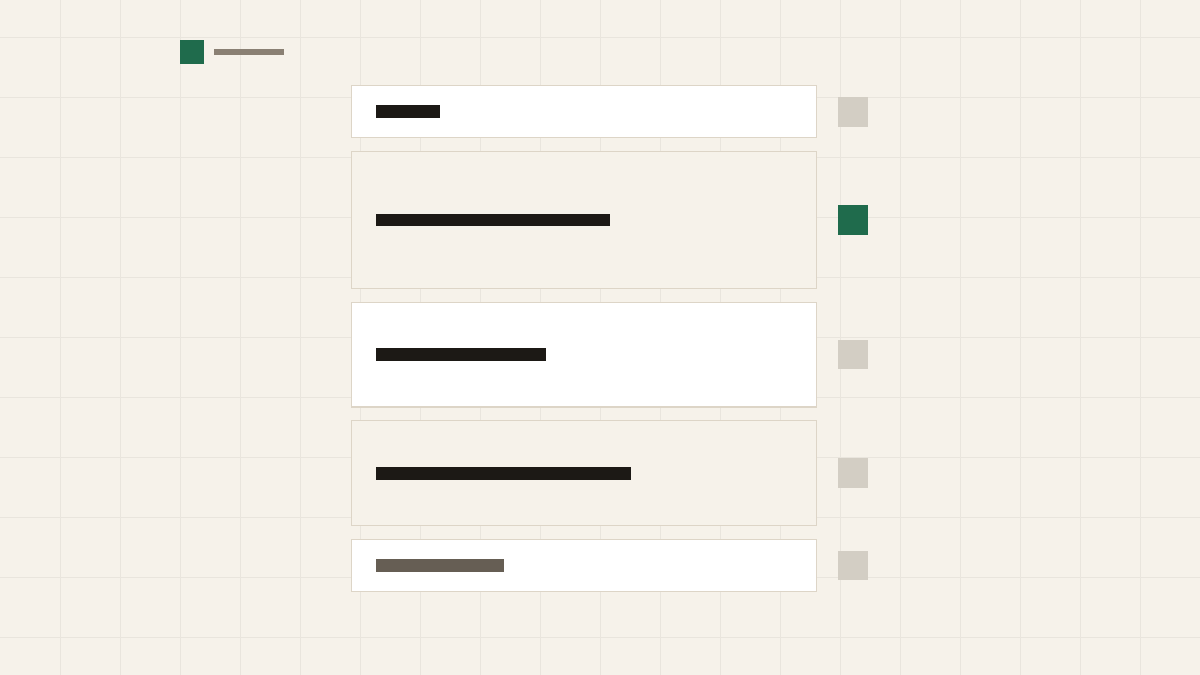
Alternate the grounds. Give neighbouring sections different backgrounds, for example white, then a light tint, then white again. It shows where one section ends and the next begins without adding lines or boxes.
Use one dark band. A single section on a dark background draws the eye, and the closing invitation is the natural place for it. Two or three dark bands compete, and none of them stands out.
Also avoid putting two sections of the same kind next to each other. Two rows of cards in a row look like one long list; put a different kind of section between them, or merge them.
- The headline says what you do and where.
- The hero has one main action that says what happens.
- Three to six services, each with one sentence.
- The steps describe what really happens after someone gets in touch.
- Every piece of proof is real and can be checked.
- The questions are ones customers actually ask.
- The page ends with the main action again.
- Neighbouring sections have different backgrounds, and only one is dark.
litetile has a ready-made section for each of these jobs, made by professional designers to sit next to each other in any order. See design and brand.
Related reading: What makes a good small business website and Calls to action that do not feel pushy.