Design and brand
Professional design, in your colours.
Every section was designed to work with every other. Your brand settings decide how they look.
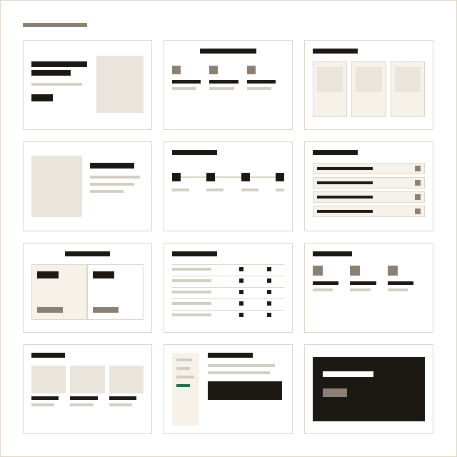
No blank canvas.
Most builders hand you a thousand options. Here spacing, proportions and type are already decided, so the page looks right whatever you add.
- One spacing and type scale for every section
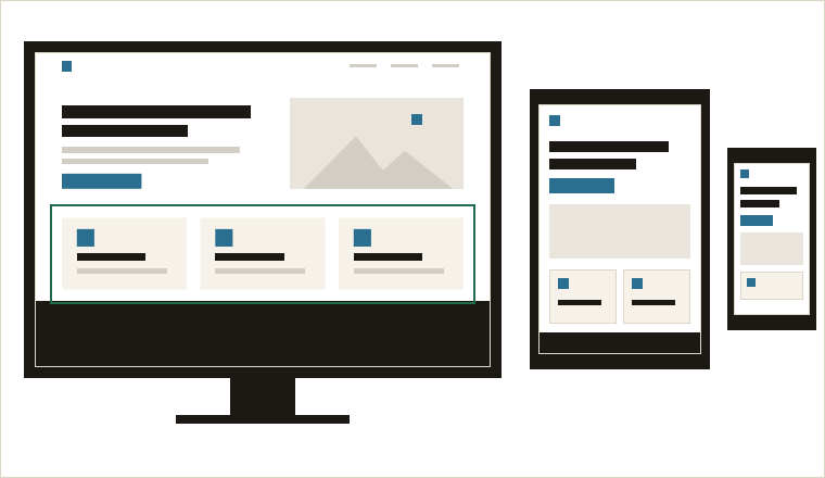
- Sections laid out for phone, tablet and desktop
- Reorder freely; neighbours still fit
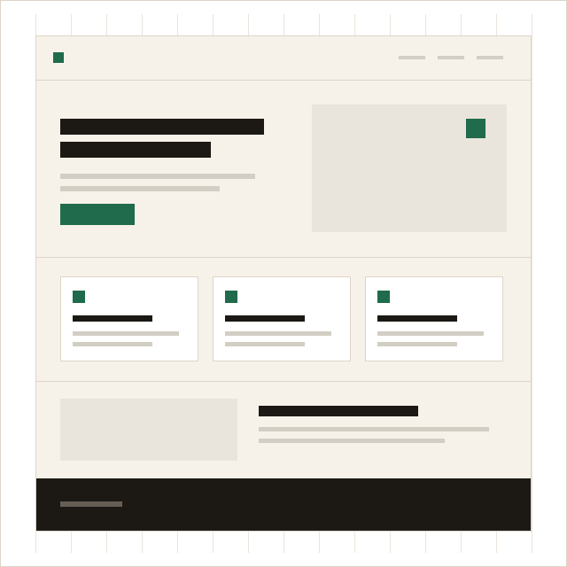
Set your brand once.
Your brand lives in one place. Change it and every section on every page follows.
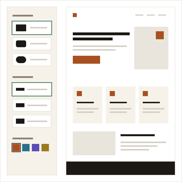
- Primary and secondary colours, text, background
- Heading and body fonts, or upload your own
- Corners, button shape, heading weight, spacing
- Logos and a favicon
What the design takes care of.
Every screen
Each section has its own phone, tablet and desktop layout.
Readable text
Type sizes and line lengths chosen for reading.
Light pages
No heavy scripts. Interactive parts use plain web features.
Room for every language
Layouts leave room for longer words in other languages.
Further reading.
The design work is done. Add your words.
Free for one page, with no time limit.