
Is a one-page website enough?
The litetile team
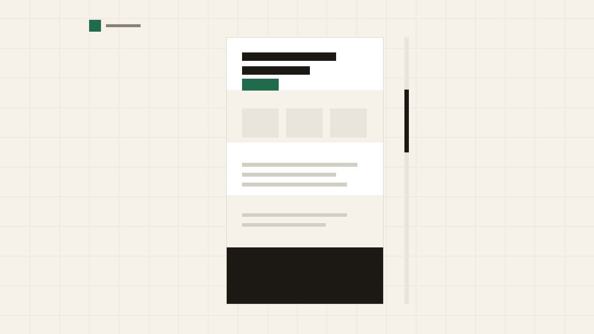
A lot of website advice assumes you need many pages. For many small businesses that is not true. One well-built page, read from top to bottom, can tell a visitor what you do, show that you do it well and make it easy to get in touch. That is most of what a website is for.
This post helps you decide whether one page fits your business and, if it does, how to put it together.
One page works when what you offer is easy to explain and your visitors have only a few questions. That describes a lot of businesses:
- A trade: an electrician, a locksmith, a gardener. People want to know what you do, where you work and how to call you.
- A practice: a physiotherapist, a tutor or a counsellor with one room and a clear list of services.
- A local shop or café: what you sell, when you are open, where to find you.
- A freelancer with one main service and a few examples of work.
In each case the visitor's path is short. They arrive, check they are in the right place, look for a sign that you are good, and get in touch. A single page lets them do all of that without choosing where to click.
One page starts to strain when:
- you offer many services, each with its own questions, prices and examples;
- you serve customers in more than one language;
- you want to publish articles, news or guides;
- different kinds of customers need different information, for example homeowners and businesses;
- you want to be found for several separate searches, each of which deserves its own page.
If two or more of these are true, a few pages will serve you better. The pages every small business site needs goes through what each one is for.
On a single page, the order does the work that menus do on a larger site. Here is an order that suits most businesses, top to bottom:
- The opening. What you do, where, and one action: call, book or ask for a quote.
- What you offer. Three to six services or products, one short line each.
- How it works. Three or four steps from first contact to job done.
- Your work. A few real photos of finished work, your premises or your team.
- Prices. Starting prices or ranges, and what changes them.
- About you. Who runs the business, how long you have been at it, your qualifications.
- Proof. A link to your reviews, the area you cover, the kinds of customers you work with.
- Questions and answers. Parking, payment, cancellations, how far you travel.
- Hours and location. Opening hours, including holidays, and a link to a map.
- The last invitation. A short closing band that repeats the main action, with your phone number and email.
The header and footer sit around these, with your logo, the main action and your contact details.
You may not need all ten. A café can skip "How it works"; a tutor may have no photos of finished work. Leave out what does not apply rather than filling a section for the sake of it.
On a long single page, a short menu at the top can jump straight to a section: "Services", "Prices", "Contact". These are links to a point on the same page, and they help a visitor who already knows what they want.
Keep that menu short, four or five items at most, and use the same words as the section headings so visitors know where they will land. Put the main action, the button that calls or books, near the top and again at the bottom, so nobody has to scroll all the way back up to use it.
Phone numbers, email addresses and your address should work as links too: a tap should start a call, open an email or show a map.
Search engines show pages, not whole sites. With one page, that page has to represent everything you do, so its title and description have to work hard. A title like "Electrician in Bordeaux: repairs, rewiring and call-outs" says what, where and the main services in one line.
The headings inside the page matter too. A heading for each service, in the words people search for, tells search engines what the page covers. Write your services, area and hours as text, not inside images, so they can be read.
What a single page cannot do well is match many separate searches at once. If people look for "boiler repair" and "bathroom fitting" as two different searches, one page about both is usually a weaker match for each than two pages about one thing. That is often the first sign that it is time to grow.
Starting with one page is not a dead end. It is a good way to learn what your visitors ask before you build more. When the page gets too long, or one section keeps growing, that section is ready to become a page of its own.
A sensible way to grow:
- move your biggest service onto its own page, and leave a short card with a link in its place;
- add a contact page once your details, hours and booking options no longer fit in one section;
- add an about page when you have more to say than a paragraph;
- keep the home page as the summary, still answering the three big questions: what you do, where, and how to reach you.
As you grow, keep the wording of your business details the same everywhere, so the facts visitors and search engines already know about you stay true.
There is no prize for having more pages. A clear single page that is kept up to date beats five pages that nobody has touched since launch day. Add a page when your visitors need it, not because a template has a slot for it.
litetile's Free plan is one page of up to 10 sections, on your own domain or a free litetile address; Studio adds unlimited pages when you need more. Compare the plans.
Related reading: The pages every small business site needs and Your home page, section by section.